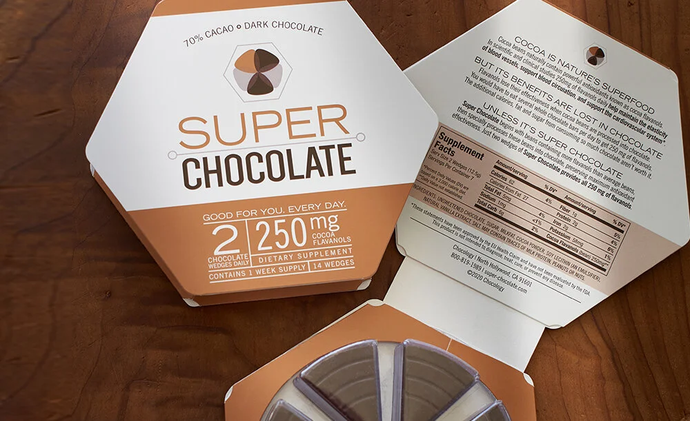
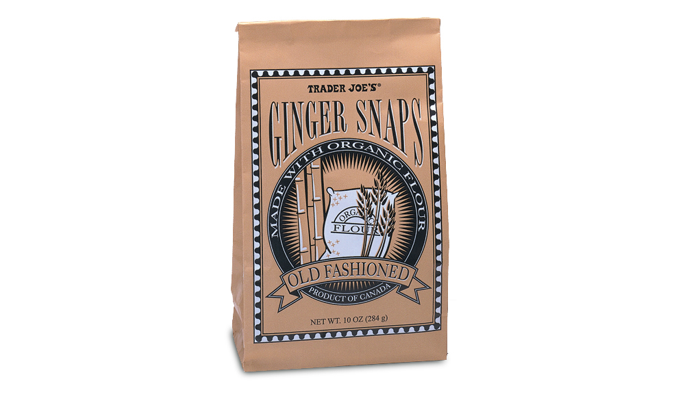
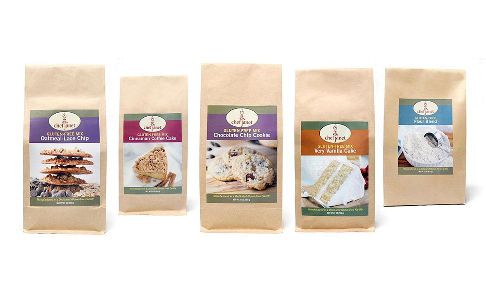
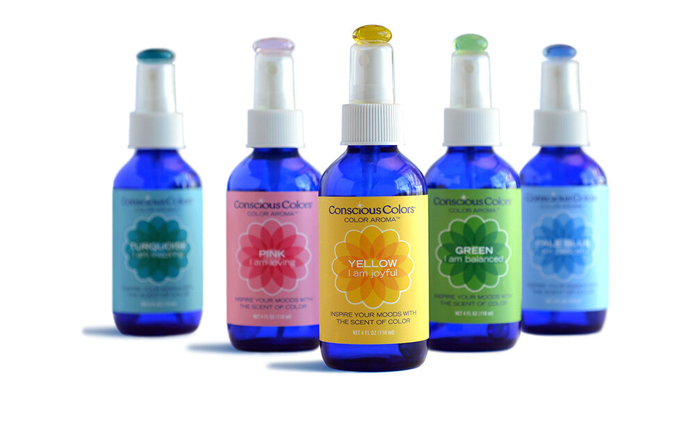
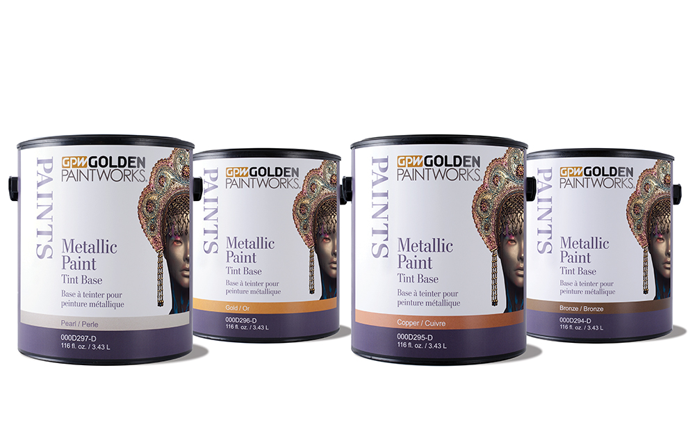
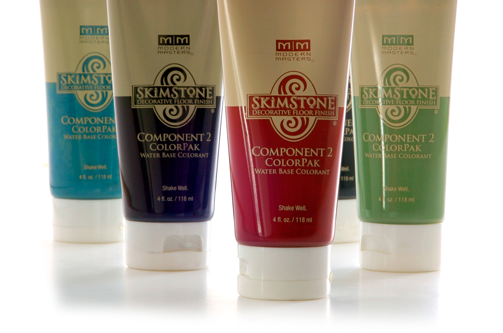
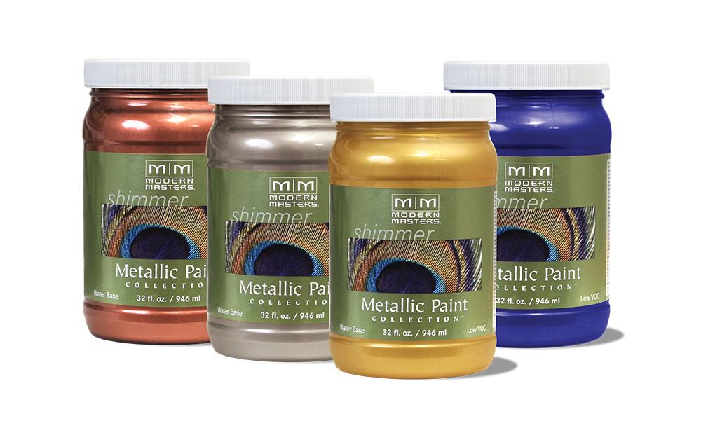
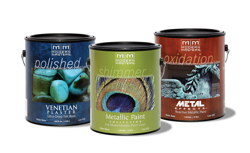
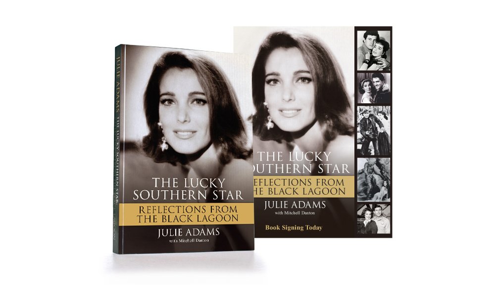
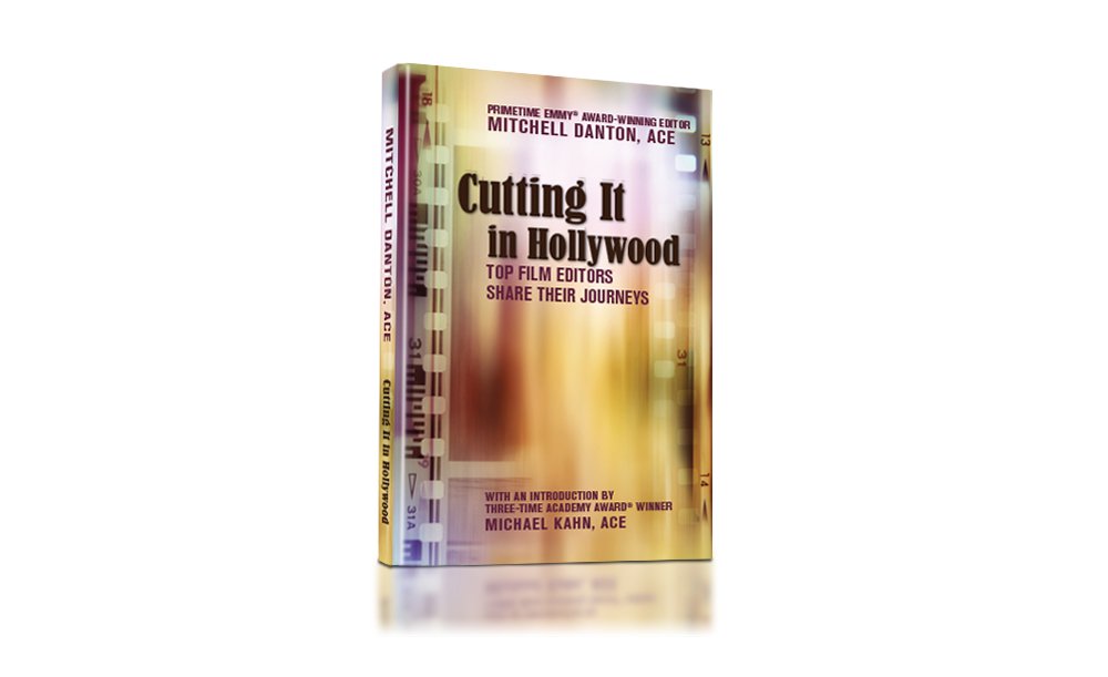
Packaging | buy me
Successful packaging puts you into your customer's hands. Only 20% of consumers know exactly what they are going to buy, the other 80% need help deciding. My focus is to help your buyer buy you.

Award Winner: Graphic Design USA
The only direction on this project was to make it look like a brown paper bag.

When working as an extension to Trader Joe's in-house art department, it's important to keep consistent style.


Working with limited color and printing techniques are always challenging, but rewarding. I offered up the name Soygurt, but the client didn't care for it.

Award Winner: Graphic Design USA
These tubes print 1-color for the entire line. As part of the design strategy, the thick band at the top hides the air gap.


Redesigned Family of Paints

New Design Applied to Full Line

New Paint Line for Front Doors

Box kit for creating a tone-on-tone finish. The white box pops off the shelf and large image shows color and finish.

These small kits are perfect for small projects. The image on the front clearly shows a before and after result for a confident purchase.

People just love to play percussion instruments - even to the point of demolishing the packaging in the stores - anything to get at those sonic toys. The challenge was to design packaging that allowed the instruments to be played. Their in-house team applied the graphics.

This is the tin that started it all. After working with founder Jon Alberon on the product name and tin design, we gave The Travelers a purpose; travel the world in search of amazing chocolate.

Award Winner: Graphic Design USA
The Travelers are always in the same position, but they dress appropriately for each state they visit.

Line of Gift Boxes

Award Winner: Graphic Design USA
The Traveler's Suitcase was designed as an in-store display.
Each piece of a real suitcase was photographed, then reassembled for printing.

Full line of travel boxes resemble what The Travelers might ship home from their adventures.

Three of my favorites.

Trader Joe's asked for really tall bottles and a wood-cut motif.

Branding across the product line.

Since there was a "quartet" of flavors, I couldn't help but suggest the names too.

This was one of the very first lines of Coconut Milks. Pouring from a coconut seemed like an obvious solution to me. So Delicious thought so too - 3 years later.

Sampling this product really helped pull the look together.

Line of Organic Milk to be sold in low-income stores. Everyone should have the choice of organic, and so to keep production cost low, we printed each carton 1-color.
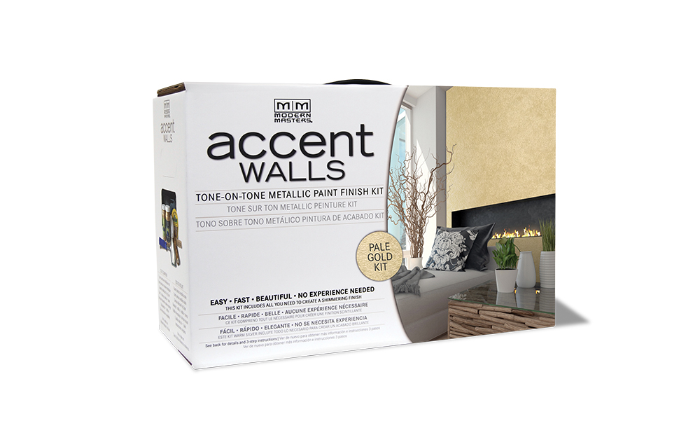
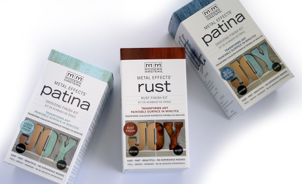
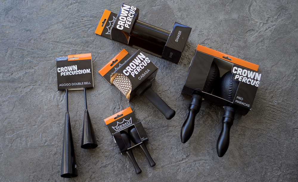
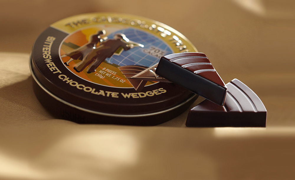
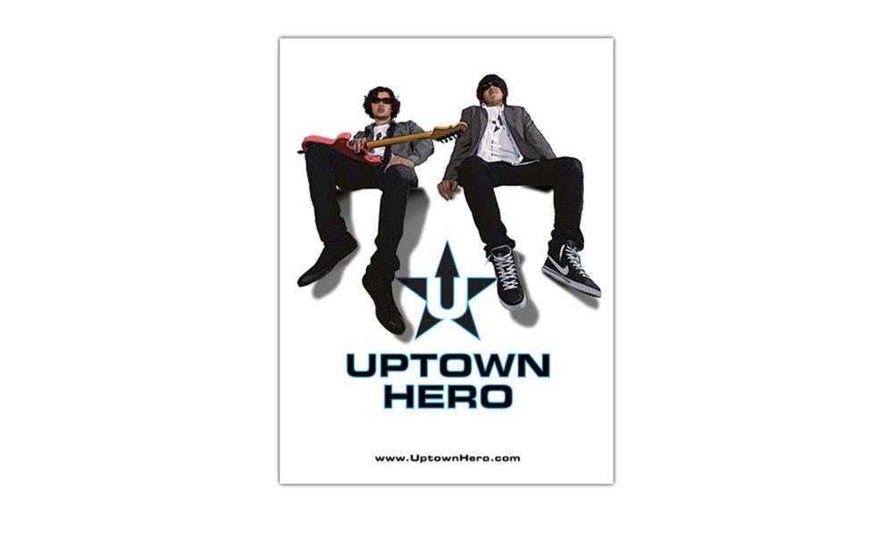
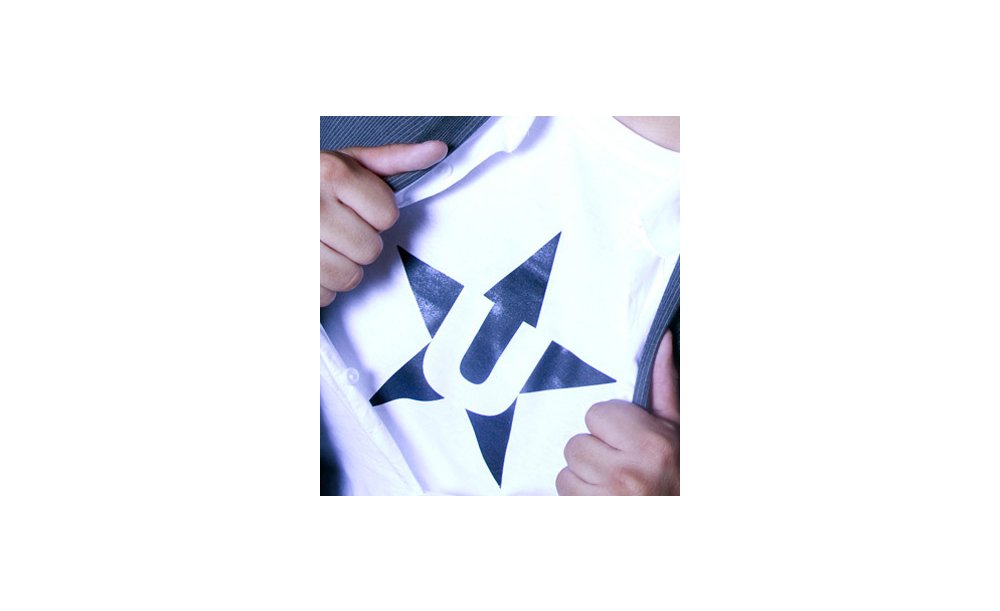
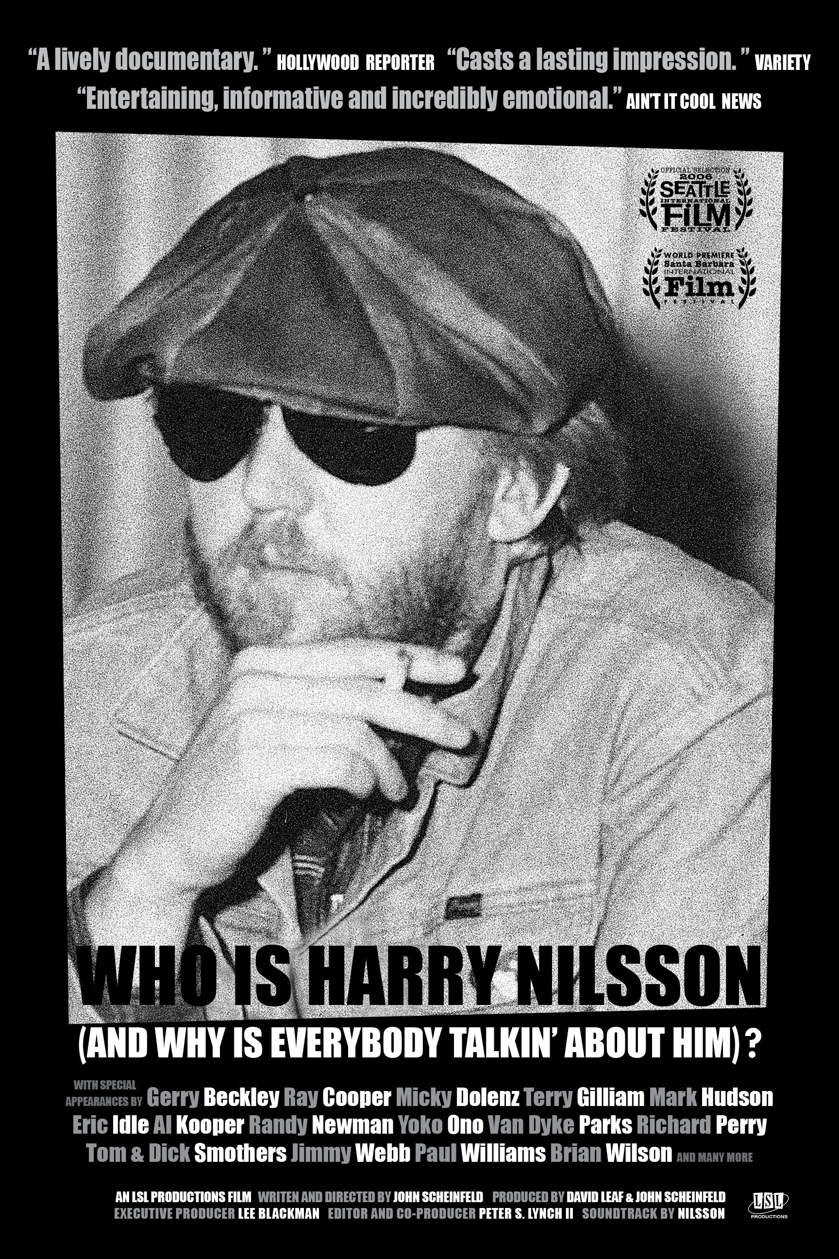
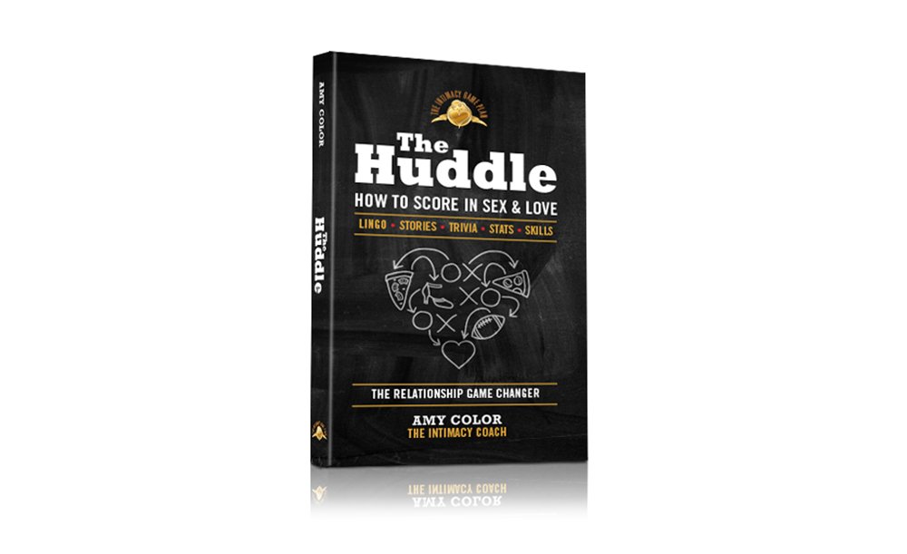
Come take a look at the design stories or continue viewing work created for more clients.